
You’re probably staring at a report right now that looks solid on paper. Reach is healthy. Engagement looks respectable. A few creators produced strong content. But you already know what happens in the meeting. Your boss scans the deck, pauses for a second, and asks the question that decides next quarter’s budget.
What did this do for the business?
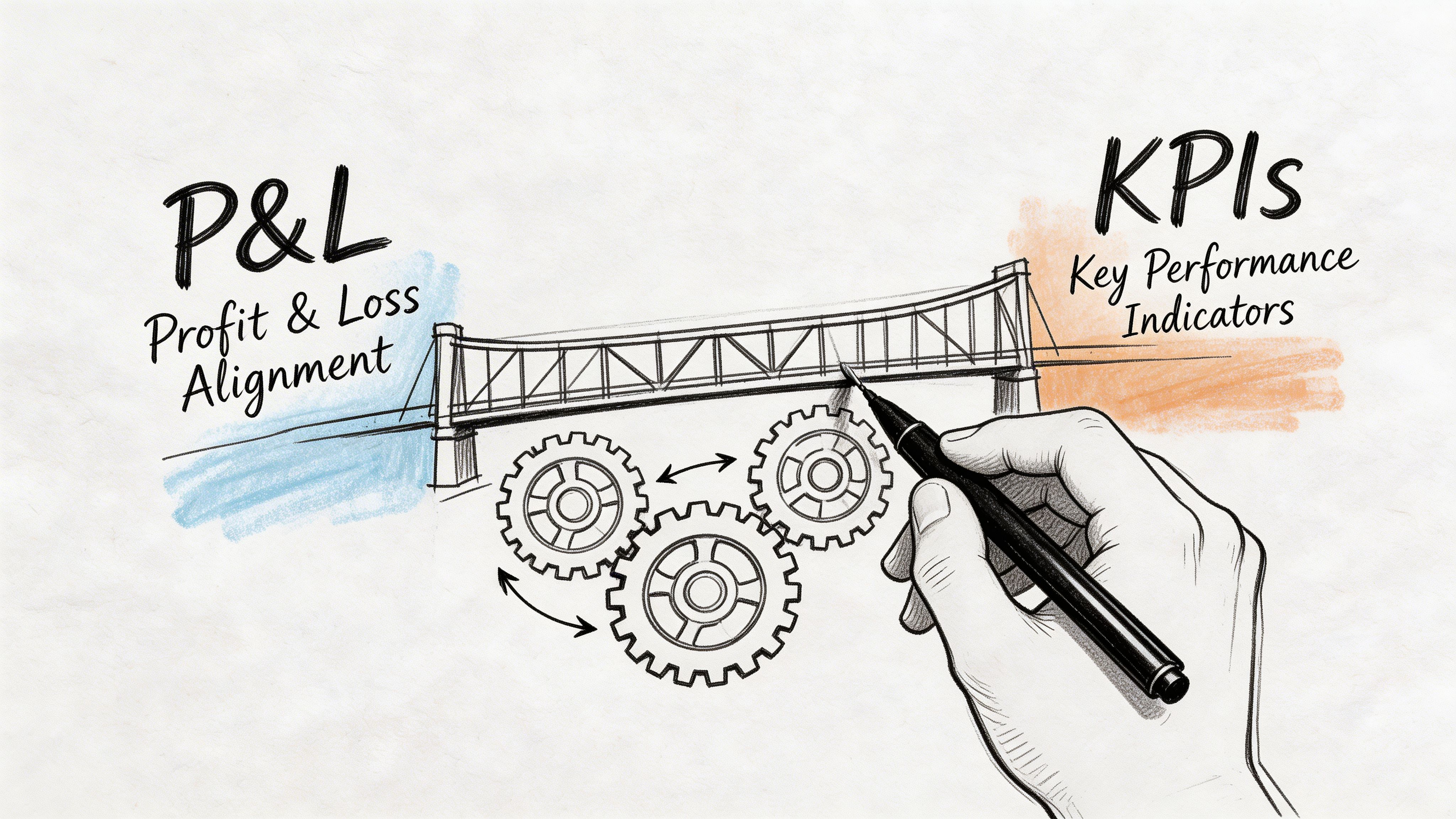
That is the whole game with Influencer Marketing Reporting: What Your Boss Wants to See. Not more charts. Not prettier screenshots. Not a longer list of social metrics. Your report has to translate creator activity into commercial evidence, clear decisions, and a plan worth funding.
Beyond Likes and Follows Why Your Reports Fall Flat
The failure usually starts with the opening slide.
Marketing teams often lead with the easiest numbers to collect. Impressions. Views. Engagement. Follower counts. Maybe a collage of polished creator posts. None of that is useless. It just does not answer the question most executives care about.
They want to know whether influencer marketing is a channel they can scale with confidence.
That pressure is getting stronger because the category itself is no longer a side experiment. The global influencer marketing market is projected to reach $32.55 billion by the end of 2025, up from $24 billion in 2024, and the same source says the channel can deliver up to 11x ROI compared to traditional digital media (Social Snowball). If you want extra context on how quickly the space is moving, this roundup of influencer marketing statistics for 2026 is useful for sense-checking where the market is heading.
The practical implication is simple. Leadership already believes influencer can matter. What they doubt is whether your programme is measured well enough to deserve more money.
Why social-first reports lose the room
A social report says, “People interacted with the content.”
A business report says, “This content moved demand, created attributable action, and taught us what to do next.”
Those are not the same thing.
A weak report usually has one or more of these problems:
It reports activity, not outcomes. A list of posts published is not a performance review.
It treats all creators as equal. Your boss needs to know who drove action and who just looked busy.
It hides uncertainty. When attribution is messy and you pretend it is not, trust drops fast.
It has no recommendation. Executives expect a decision memo, not a data dump.
What good reporting does differently
The best reports frame influencer as a measurable growth channel.
They answer four things quickly:
What we spent
What happened
What it likely drove
What we should change next
If your first slide cannot be read in under a minute and repeated back by a finance lead, it is not finished.
That sounds blunt, but it is the standard. Leadership does not need every metric. They need the handful that connect creator output to pipeline, bookings, revenue, content value, or local demand.
When your reports fall flat, the problem is rarely lack of effort. It is usually lack of translation.
Choosing KPIs That Speak the Language of Business
Executives rarely argue with metrics. They argue with relevance.
If the report leads with reach, likes, and screenshots, the conversation drifts into whether the campaign looked busy. If it leads with commercial movement, efficiency, and what to change next, the discussion stays where it should. Budget, confidence, and next-quarter planning.
A good refresher on understanding key performance indicators helps here, especially for teams that still treat KPIs as a long checklist instead of a decision tool.
Wearisma’s 2025 reporting data shows the pressure clearly. Measuring creator performance is the top roadblock for 32% of marketers, and the same research found teams under executive scrutiny concentrate on social media engagement metrics (68%), link traffic from posts (50%), and increased website traffic (45%) (Wearisma).
The fix is not adding more metrics. The fix is ranking them.
I use a four-layer KPI stack because it gives leadership a clean story arc. Did people see it. Did they care. Did they act. Did the action justify the spend. That structure also makes one-page reports easier to scan, especially for ecommerce teams and multi-location brands that need the headline fast.
Build your KPI stack in four layers
Awareness
Use awareness metrics to show whether the campaign earned enough attention to deserve deeper analysis.
Track:
Reach
Impressions
Views
Share of voice
Content volume
These metrics matter early in the report, but only as setup. A senior leader does not need a long discussion about impressions unless you connect them to audience quality, market coverage, or efficient creator output.
Useful translation:
Reach becomes audience exposure
Impressions become frequency of market contact
Content volume becomes output from creator investment
Consideration
This layer shows whether the audience responded in a way that suggests interest rather than passive viewing.
Track:
Engagement rate
Comments
Saves
Shares
UGC volume
Sentiment themes
I usually keep this section tight. One or two lines on why certain creators got stronger saves, shares, or comments is enough. The executive question is simple: did the content resonate with the right people strongly enough to create buying intent?
Useful translation:
Engagement rate becomes message resonance
Saves and shares become intent signals
Comment quality becomes audience relevance
Conversion
Weak reporting gets exposed in this section.
Track:
Link clicks
Sessions from UTM links
Promo code redemptions
Bookings
Add-to-cart behaviour
Purchases or lead submissions
This layer should identify which creators drove measurable action, which formats produced lower-friction traffic, and where the drop-off happened. For restaurants, that might be bookings or offer redemptions. For ecommerce, it is usually sessions, add-to-cart activity, purchases, and code use by creator.
Useful translation:
Clicks become traffic generation
Promo codes become direct response evidence
Bookings become offline demand capture
Business impact
This is the layer that gets budget approved or cut.
Track:
Attributed revenue
ROAS
CPA or cost per booking
Incremental learnings by creator type
Content reuse value
Recommendation for next investment
At this point, stop talking like a social team and start talking like an operator. Which creator tiers were efficient. Which placements produced margin. Which markets responded. Which spend should shift next month. For teams that need a clearer model for tying creator activity to commercial return, this influencer marketing ROI guide focused on what works is a practical reference.
A simple KPI translation table
Marketing KPI | What it means to marketing | What your boss hears |
|---|---|---|
Reach | How many people saw it | Market exposure |
Engagement rate | How strongly the audience responded | Audience quality and message fit |
Link traffic | Visits driven from content | Demand generation |
Promo code use | Direct tracked action | Sales influence with proof |
Attributed revenue | Revenue tied to creator activity | Commercial return |
ROAS | Revenue relative to spend | Budget efficiency |
What to leave out
Every extra metric has a cost. It takes attention away from the numbers that support a decision.
Cut or demote:
Raw follower counts unless audience quality matters to creator vetting
Likes without context
Platform screenshots with no business takeaway
Average metrics that hide creator-level variance
A metric earns space in the report only if it explains performance, supports spend, or changes the next recommendation.
Everything else belongs in the appendix.
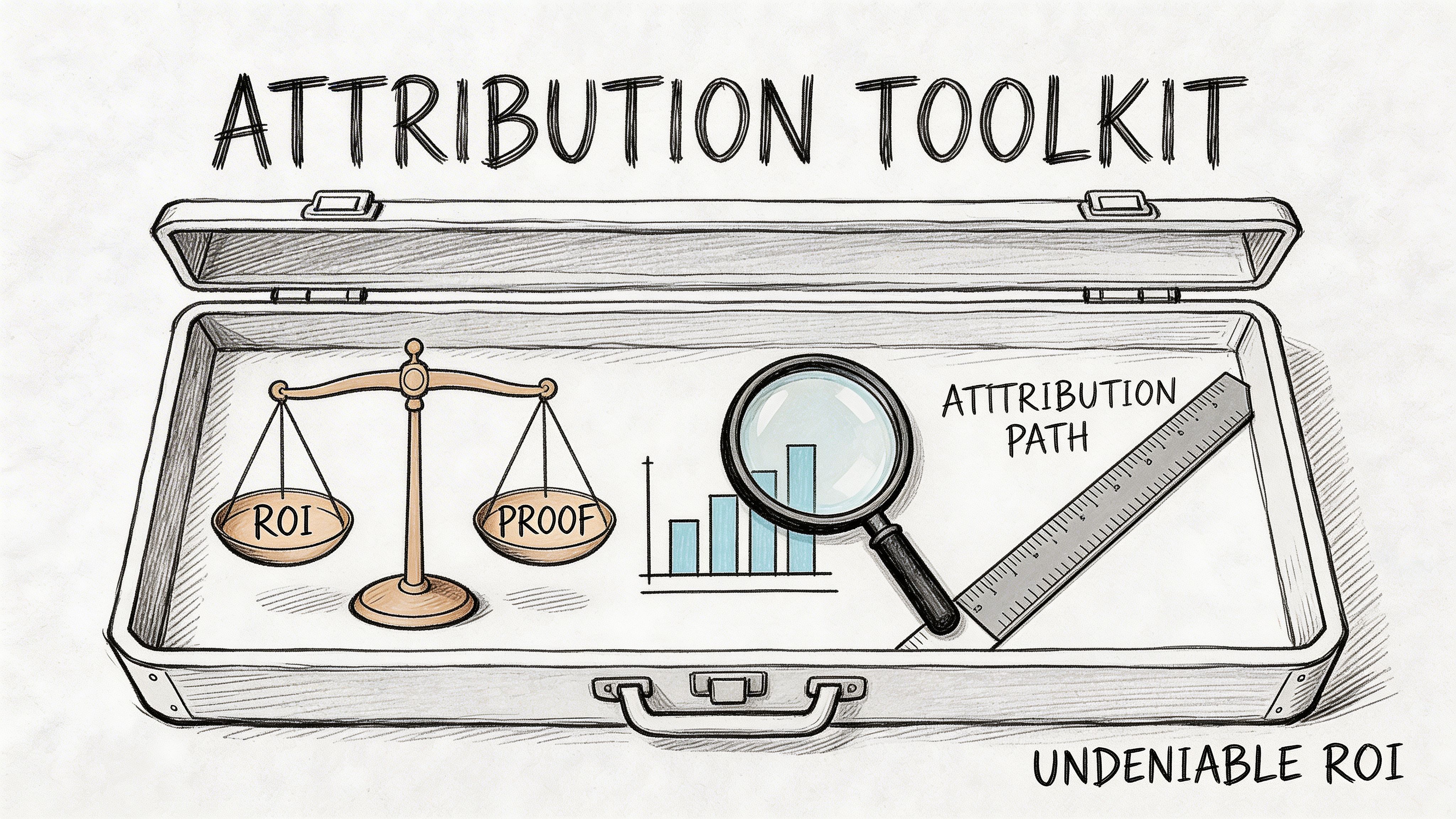
Your Attribution Toolkit for Bulletproof ROI Tracking
If your report claims ROI without a tracking method, you are asking leadership to take it on faith. They won’t.
Attribution does not need to be perfect before it becomes useful. It does need to be organised, consistent, and explained in plain English. If anyone on your team needs a quick primer, this explainer on What is Attribution in Marketing? is a clean starting point.
In UK influencer reporting, the most defensible setup combines unique UTM parameters and influencer-specific promo codes. Meltwater cites an average ROI of 5.2:1 for micro and nano creators in ecommerce and hospitality, with 78% of campaigns exceeding 3x ROAS when using promo codes for attribution (Meltwater)).
Tool one is promo codes
Promo codes are still the cleanest bridge between creator activity and commercial action.
They work because they answer a simple question: did someone transact using an identifier tied to a specific creator?
For ecommerce, that usually means discount or affiliate-style codes. For restaurants, it can mean booking incentives, set-menu offers, or redemption-based footfall tracking.
A practical format:
Brand + creator or location code
Examples such as a city abbreviation, creator handle shorthand, or campaign label
One code per creator, never shared across multiple partners
What promo codes solve:
Direct purchase attribution
In-store or booking-linked redemption
Easy creator comparison
What they miss:
People influenced by the post who do not use the code
Customers who convert later through another channel
So promo codes are strong, but not complete.
Tool two is UTM links
UTMs tell you what happened after the click.
You should create a naming convention before a campaign starts and keep it boringly consistent. That matters more than clever labels.
A useful structure often includes:
utm_source for the creator identifier
utm_medium for influencer or promo
utm_campaign for the campaign name
Optional detail for platform, location, or creator tier
That gives you clean reporting inside GA4 and helps you compare creators, content formats, and campaign themes without manual cleanup.
For teams building this process at scale, https://sup.co/blog/how-to-track-influencer-marketing-attribution-promo-codes shows how to standardise tracking across creators with codes and links from the outset. Sup is one option here. It handles unique promo codes, UTM links, real-time tracking, and a central reporting view so teams are not stitching together spreadsheets after launch.
Tool three is dedicated landing pages or affiliate links
Use these when the campaign is large enough to justify extra control.
Dedicated landing pages help when:
The offer is campaign-specific
You need copy matched to creator messaging
You want tighter conversion tracking from traffic to sale or booking
Affiliate links are useful when:
You need creator-level payout logic
You are running ongoing partnerships
Revenue share matters more than one-off promo bursts
This is also the point where stronger reporting teams separate creator-level performance from campaign-level influence. One creator may drive direct redemptions. Another may create high-intent traffic that converts later through email, paid retargeting, or branded search.
That difference matters in budget reviews.
Here is a practical walkthrough worth sharing with teams before they launch tracking-heavy campaigns:
The setup that works in practice
If I had to strip attribution down to a minimum viable stack, it would be this:
Baseline first Pull pre-campaign traffic, conversion, and booking benchmarks in GA4 or your analytics stack.
Give every creator a unique code No exceptions. Shared codes kill comparison.
Tag every creator link with UTMs If the creator can post a link, it must be tagged.
Keep naming conventions fixed If one campaign says “nano_uk_tiktok” and the next says “TikTokNanoLondon”, your reporting gets messy fast.
Decide the attribution window before launch Do not argue about timing after results come in.
Reconcile platform data with backend data Platform engagement can support the story, but backend sessions, redemptions, orders, and bookings should anchor it.
Good attribution does not remove uncertainty. It reduces uncertainty enough that a budget decision becomes rational.
That is the standard to aim for.
How to Structure a Report Your Boss Will Read Effectively
The deck usually fails before the data does.
Executives do not read reports the way marketers build them. Marketers often start chronologically. Brief, creators, content, reach, engagement, clicks, conversions, learnings. That order feels logical if you ran the campaign.
It is the wrong order for decision-makers.
Leaders want the answer first. Then they want enough supporting evidence to believe it. Anything beyond that is backup material.
Ruler Analytics makes the reason clear. Marketing data contains significant measurement gaps, and those gaps create flawed decisions when reports do not explain how attribution was reconciled and how influencer impact was separated from other channels (Ruler Analytics)).
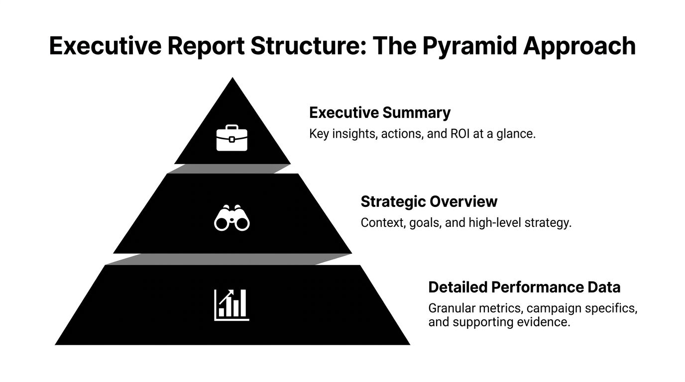
Use the pyramid structure
Think of the report as a pyramid, not a timeline.
At the top sits a short executive summary. Beneath that comes strategic context. At the base sits detailed campaign evidence.
That structure works because different stakeholders stop at different layers:
Senior leadership often reads the top only
Marketing leaders read the top and middle
Channel specialists and analysts use the full deck
What goes on page one
Your first page should answer the meeting’s hardest questions immediately.
Include:
Campaign objective
Total spend
Attributed outcomes
Commercial read on performance
One clear recommendation
A simple executive summary template:
Field | What to write |
|---|---|
Objective | Drive tracked sales, bookings, or qualified traffic through creator partnerships |
Investment summary | Total campaign cost and major cost drivers |
Outcome summary | Attributed revenue, bookings, code redemptions, or traffic trend |
Performance read | Performed above, in line with, or below target and why |
Next action | Scale creator type, change offer, refine geography, or pause a segment |
Do not fill this page with screenshots.
Do not lead with engagement.
Do not make your boss search for the commercial point.
The middle layer should explain performance, not repeat it
Once page one lands, use the next few pages to explain why the result happened.
Good middle-layer slides include:
KPI versus target view
Show where the campaign landed relative to target or baseline.
Useful categories:
awareness
response
conversion
business impact
Keep commentary short. One or two lines per metric group is enough.
Creator split
Break out top and bottom performers with an explanation.
The most useful split is not “best by engagement”. It is “best by business contribution”.
Explain:
who drove direct action
who generated high-quality traffic
who produced content worth reusing
who looked strong in-platform but weak in backend results
Content analysis
Executives do not need every asset. They do need to know what kind of creative worked.
Summarise:
product demo versus lifestyle content
direct offer versus softer recommendation
local relevance versus broad awareness angle
short-form urgency versus evergreen social proof
The appendix is where your proof lives
Detailed creator-level rows, UTM exports, redemption breakdowns, and platform screenshots belong here.
The appendix matters because sceptical leaders often ask one question that sounds simple and is not: “Can you show me how you got this number?”
If your answer is buried in five different spreadsheets, your credibility suffers.
A report feels trustworthy when the headline is simple and the proof is available on demand.
A practical narrative framework
When I build reports for sceptical audiences, I use this sequence:
What we asked the channel to do
What happened in tracked terms
What likely influenced results beyond direct attribution
What we learned about creators, offers, and audience fit
What changes in the next round
This structure keeps you honest.
It also stops the common mistake of overselling causality. If direct attribution is partial, say so. If branded search or repeat traffic likely played a supporting role, note that. Executives usually handle nuance better than marketers expect. What they do not tolerate is fuzzy certainty.
What not to do
Avoid these common deck habits:
Twenty-slide overproduction
Platform screenshots with no interpretation
Unexplained discrepancies between Shopify, GA4, booking systems, and creator-reported metrics
No benchmark or no recommendation
Burying weak performance at the end
A report should read like a decision memo with evidence attached. If it reads like a content recap, you are making the boss do the strategic work for you.
Industry-Specific Reporting Templates You Can Steal
Generic reporting looks tidy and performs badly.
A DTC founder, a restaurant operator, an agency client lead, and a regional marketing director do not care about the same outcomes. If your report treats them as if they do, it will feel shallow even when the data is accurate.
The fix is simple. Build a one-page template around the operating model of the business.

Template one for ecommerce and DTC
This audience wants commercial clarity fast.
Their one-page report should prioritise:
Spend
Attributed revenue
ROAS
Promo code redemptions
UTM-driven sessions
Conversion trend by creator
Top-performing content angle
Suggested layout:
Top strip with objective, spend, revenue, ROAS
Left panel with creator ranking by revenue contribution
Right panel with traffic and conversion flow
Bottom panel with what to scale next
Suggested commentary:
“Micro creators drove stronger tracked purchase intent than larger lifestyle profiles.”
“Direct-response creative converted better than broad product-awareness content.”
“Code usage was concentrated among a small number of creators, which supports a tighter next-round roster.”
Template two for restaurants and hospitality
Restaurants need reports that connect influencer activity to bookings, footfall, redemptions, and reviews.
Their one-page report should prioritise:
Booking link clicks
Promo code or offer redemption
Daypart or weekend performance
Review volume and review themes
Best-performing location or area
Creator fit by local audience
Suggested layout:
Headline with campaign goal such as bookings, launch traffic, or menu promotion
Middle section showing location-by-location performance
Smaller panel for creator-level redemptions
Closing box with timing and local audience learnings
Suggested talking points:
Which creators drove actual table demand versus broad awareness
Whether the offer worked better around weekends or specific booking windows
Which neighbourhood or catchment area responded most strongly
Many hospitality teams improve their reporting immediately at this stage. They stop using ecommerce language for an offline demand problem.
Restaurants do not need a prettier awareness report. They need evidence that creator activity moved bookings, walk-ins, or review behaviour.
Template three for agencies
Agency reports have two jobs. Prove campaign performance and prove account competence.
That means the one-page view should include both results and process control.
Include:
Client goal
Delivery against scope
Tracked outcome summary
Creator roster quality
Content output
Optimisation actions taken during campaign
Recommendation for next test
A useful agency framing is:
what was planned
what shipped
what produced measurable action
what the agency learned and changed
Clients are usually calmer when they can see active management, not just post-campaign reporting.
Template four for multi-location brands and franchises
Teams often underbuild this format.
Multi-location reporting should show local variation clearly. One national average can hide major differences by city, store cluster, or creator geography.
Build the page around:
Region or location map
Creator activity by market
Performance split by location
Offer response by area
Operational notes from local teams
Recommendation on where to expand or pull back
Suggested layout:
Top summary with the national read
Centre map with creator and performance overlays
Side panel with top and weak regions
Bottom section with local operational learnings
Local influencer effectiveness often comes down to context:
creator-audience proximity
location convenience
local culture and demand patterns
campaign timing against trading periods
A fill-in-the-blanks framework you can adapt
Use this sentence structure in any of the templates above:
Objective “The campaign was designed to drive [tracked outcome] for [brand, product, location, or offer].”
Commercial result “The programme generated [business outcome] through [tracking method], with strongest contribution from [creator type, region, or content theme].”
Performance explanation “Results were supported by [behaviour or signal] and limited by [constraint, tracking gap, or audience mismatch].”
Decision “Next round should [scale, narrow, test, or pause] based on [specific observed pattern].”
What makes these templates work
They are not just shorter. They are better aligned.
Each version does three things well:
it uses the business’s actual success criteria
it highlights tracked evidence over general social proof
it ends with a decision, not a celebration
That is the difference between a report that gets nodded through and one that shapes budget.
Refining Your Reports and Answering Tough Questions
A lot of teams think reporting should stay upbeat at all times. That instinct is understandable and usually counterproductive.
Executives trust teams that call things clearly. If a campaign underperformed, say it. Then explain whether the issue was creator selection, offer strength, timing, audience fit, tracking setup, or conversion friction.
That level of honesty matters because weak reporting habits are common. In the UK, 48% of reports are rejected by executives for lacking peer benchmarks, 62% of campaigns underperform due to poor creator vetting, and 55% of agencies overlook long-tail effects by not using a 90-day attribution window (Superfiliate)).
Report on cadence, not just campaigns
One end-of-campaign deck is rarely enough.
Use a cadence that matches the work:
Weekly updates during live campaigns for pacing, creator delivery, and early response signals
Monthly summaries for trend analysis and optimisation decisions
Quarterly reviews for budget, channel role, and creator programme direction
That cadence helps you catch bad fits early instead of writing a defensive post-mortem later.
How to report a weak campaign without losing trust
A poor result does not damage credibility nearly as much as evasive reporting.
Use this format:
Result State what missed expectation.
Likely causes Narrow it to the few factors that matter most.
Evidence Use creator, traffic, redemption, or landing-page patterns.
Action Show what changes in the next round.
For example, if engagement looked healthy but code usage was poor, the issue may not be content quality. It may be weak offer design, vague call-to-action, or the wrong creator audience.
Address discrepancies before someone else does
Sooner or later, a boss will ask why platform numbers, GA4, and backend sales do not line up perfectly.
Answer directly:
platforms count interactions differently
users move across devices and channels
some influenced conversions arrive later
some traffic is visible in one system and partial in another
Then show how you reconciled the data:
direct tracked conversions from codes
UTM-driven sessions and actions
attribution window used
exclusions or assumptions applied
Executives do not expect perfect attribution. They expect you to know where the gaps are and how you handled them.
Bring benchmarks into the room
Benchmarks help people interpret performance. Without them, a good result can look average and an average result can get oversold.
Use benchmarks carefully:
compare against your own prior campaigns first
then use relevant market or creator-tier context
avoid random cross-industry comparisons that sound impressive but change nothing
Refine the narrative every round
The report should improve as the programme matures.
Early on, focus on proving tracked action. Later, focus on efficiency, repeatability, creator quality, and local scaling logic. A strong reporting system gets sharper each quarter because your team learns what leadership needs to make a decision.
That is when reporting stops being admin and starts providing strategic advantage.
Frequently Asked Questions About Influencer Reporting
How do we measure a campaign focused on awareness only
You still need business framing.
Use awareness metrics as leading indicators, then connect them to site traffic patterns, branded search movement, audience engagement quality, and content reuse value. Be explicit that the campaign goal was upper-funnel exposure, not immediate conversion. The mistake is presenting awareness as if it were revenue.
What is the difference between influencer-generated revenue and baseline sales lift
Influencer-generated revenue is the portion you can track directly through methods like promo codes, UTM-linked sessions, affiliate links, or booking flows. Baseline sales lift is broader. It includes demand that may have been influenced by creator activity but converted through other channels later. Keep those two lines separate in the report.
How do we know creator audiences are real
You never know from follower count alone.
Use audience vetting before launch, then validate with campaign behaviour after launch. Look for reasonable click quality, real code use, credible comments, and consistency between content response and backend actions. If a creator produces social engagement but no downstream quality signals over time, question the audience fit or authenticity.
How should we talk about UGC value
Do not bury it in a creative appendix.
Creator content often has value beyond the initial post because your team can reuse it across paid social, organic social, landing pages, email, and sales materials if rights allow. Report UGC as an asset created through the campaign, then connect it to practical reuse cases rather than vague “brand value”.
What if several channels influenced the same sale
Say that clearly.
Do not claim exclusive credit if the path included email, paid search, or direct traffic. Present the direct attribution you can prove, then explain the wider influence path where relevant. This usually increases confidence because it shows discipline, not overclaiming.
How long should we wait before judging results
Long enough to match the buying cycle and redemption behaviour of the business.
Some campaigns show direct response quickly. Others keep generating traffic, bookings, and conversions after the content goes live. Set the attribution window before launch and report both early results and longer-tail performance where relevant.
If you want a simpler way to build executive-ready influencer reports, Sup gives teams a practical operating layer for sourcing creators, launching campaigns, tracking promo codes and UTM links, and pulling views, clicks, redemptions, conversions, and revenue into one place. That makes it easier to present the commercial story your boss cares about, without rebuilding the reporting process from scratch every campaign.

Matt Greenwell
Share